So while I’m tapdancing- look! Shiny!

Late last night I had asked folks on my personal journal for suggestions on what I should talk about at DGD. Since I’m a designer, not a writer (nor do I aspire to be one, or play one on TV), and like it or not, blogging in public is well, blogging in public, it’s partially about who is reading as opposed to who is (grudgingly) writing.

I got a lot of suggestions, but the biggest problem I found with them is that they all tend to run into a roadblock somewhere along the way. Either they’re asking about things that I don’t have enough information about to speak on with any kind of firm knowledge, or they’re asking for in-depth things about past projects, which I don’t mind doing but I worry that it will get me further typecast into kinds of design I honestly am trying to break away from since that’s what people will see when they come here.

On the other mitten, I also worry about talking too much about projects I’m just starting to work on, or am conceptualizing. On the one hand, I am all for the free exchange of ideas and it is more about what kinds of design I’d like to be doing. What I worry about is more along the lines of intellectual theft.

And on the third mitten (just call me Kali…), I would like to do more here than just praise or criticize other things on the intertubes, because seriously, that gets old really fast, and I’m a designer, not a design critic, even if thoughtful critique is part of what we do. Granted, I can be a grumpy, critical bitch better than most, but still, I could probably rest on my laurels on that score *forever* at this point and still come out looking like a champ.

So any suggestions (though I am going to try to work my way around the slalom of suggestions I got last night) are welcome. Questions are, as well.

In the meantime, while I’m tapdancing, I wanted to go back to restaurant design for a moment. Okay, not for a moment, since that remains my favorite kind of design. But for now, a moment.

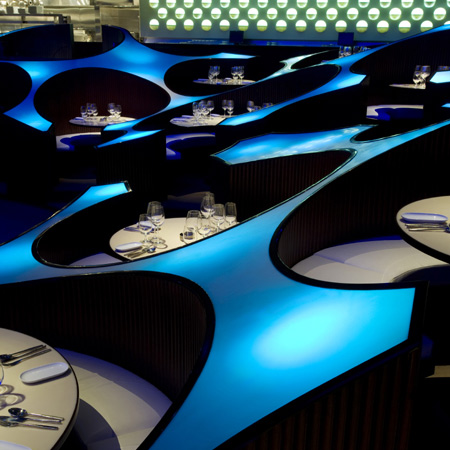
See, design photography is really difficult. It’s often hard to get a decent angle on a space. You’re using a wide angle lens in order to get the whole thing in, which creates a forced perspective and makes rooms look larger than they are. Most restaurants don’t have lighting suited to good photography. Even though it’s a room, and not a person (though sometimes there are people in the room) it’s hard to show what a restaurant really looks like without physically being there in a way that doesn’t “lie”, for good or bad. It occurred to me tonight that I hadn’t taken the opportunity to mention someone who I think does this better than anyone I’ve ever seen.

Noah Kalina(who, as far as I know, is of no relation to my dear departed friend Amy, and isn’t someone I know. I’ve just had his site bookmarked for ages and I think he takes amazing shots of restaurants.) By means of example (and hopefully a way to get everyone to go there and check his archives because they’re amazing), this is his photo of Bar Boulud:

Bar Bouloud, photographed by Noah Kalina

Since I know some of you are totally into restaurant design porn, that ought to keep you busy until I can figure out what I should be talking about here. I’ll be over here tapdancing (and knitting) in the meantime.

P.S. Tori, stop drooling on the keyboard.

You might be paid to think, but you’re not paid to read like stereo instructions.

“You’re not paid to think.”

Well actually, I am paid to think. It’s one of the best things about this job. It requires you to have a brain in your head. (see: differences between designers and decorators, part #4,587) I love the fact that I’m paid to think. For someone who tends to live in their head anyway (like me) this is an absolute bonus plan.

Here’s the thing though: I don’t understand why so many people who are paid to think also think they’re paid to write using a pretentious, specified lexicon where it’s not needed, in order to sound like they’re somehow more elite than the average schmuck who is reading what they’re saying. I read a LOT of architecture and design material, and so much of it is full of shit. Not because the *ideas* themselves are bad- they’re not(okay, well sometimes they are, but not in any greater percentage over any other ideas presented differently). I just have a hard time suppressing the urge to slap people upside who can’t figure out how to write without sounding like they came out of a 15 week course in Art Criticism and Pretension, and got an A.

It’s not a matter of vocabulary, in the sense of “words one doesn’t understand”. It’s a matter of sounding like you’re deliberately going out of your way to exclude as many people who are not as “in the know” as you are. In the end, so many times people wind up sounding like *complete morons* because of it. What? Do you think you get paid more if you sound like that? Only if your clients are seriously stupid, and one would hope that they aren’t, because stupid clients are a pain in the ass.

I was reading something yesterday and there was a comment that made me think “What the hell does that even *mean*? Does the author even know, or did they just pull random words out of a hat, reordered them so they were grammatically correct, and is having a fantastic laugh over how “enlightened” they sound.

Come on, knock it off. You’re not fooling anyone.

Cool stuff.

Though there’s plenty of things I see in the design world every day that I don’t like, there’s also things I really *do* like. Dezeen serves up the goods today by bringing this, by Serie Architects.

Blue Frog, by Serie Architects

Whooboy, that’s nice.

More photos are available at Dezeen and the Serie site itself. Though I’d have chosen a horseshoe configuration rather than the more rectilinear one Serie chose for the table arrangement (Scratch that. I’ve now seen the plans. It’s a circle, not a rectangle. The angle of the photo I saw of the long view is too low to show it, so it looks like a rectangle. +10 points for the original plans. Carry on.) The results are drop dead gorgeous. So much good work is coming out of Asia and the Middle East right now. It’s very inspiring. I also remind myself that it’s somewhat easier to go nuts in a location with more space and fewer regulations (and *everywhere* has fewer regulations than NYC) . Still, restaurant design remains my favorite kind, and stuff like this is part of the reason why.

In other “cool things I found today” news, is the portfolio of Martin Žampach, a designer from the Czech Republic. There’s some wonderful stuff in there, and I’m happy to show him to people here(I don’t know this guy, btw. I just found him today whilst linkhopping.). Have a look. 🙂 It makes me wonder if I should put my portfolio in a format like that. Maybe, but the thought of that level of hassle is going to keep me from it for the moment. .pdf will have to suffice right now.

I got an idea for a group of furniture pieces today, which is good, since I’ve been entirely dead on the inspiration front since this time last week. It usually takes me at least several days to recover from a few really bad days, so I guess this is a good sign. I’m going to see if I can get a friend to help me with my idea, since it comes from a photographic angle, rather than from sketching. Also some ideas for the design solution to the Miami house are coming together. Unfortunately, I can’t commit them to CAD until midweek next week, when my much abused but beloved computer Chuck undergoes a major overhaul to become Chuck v.3.0. I’m trying to baby the system until then, lest it lock up and refuse to reboot (again.)

Still, even putting them in CAD next week puts me a week ahead of the game, timeline wise so that’s okay. Tiny steps. Tiny steps.

It’s not about you.

I’m entirely open about the fact that residential design is not my idea of a good time. I don’t think I’ve ever made that a secret and I can’t imagine why I’d start now. I’ve done a lot of it though, and I still continue to do it despite the fact that it often makes me want to take a cheese grater to my eyeballs.

But this isn’t a post about my lack of enchantment with residential work. It’s a post (in what is I promise, an endless series, because I will never run out of reasons) of why I hate “design television”.

Almost all of the programs about design on television aren’t really about design, but that’s a topic for another day (see I told you I will never run out). But the vast bulk are about people’s houses, rather than about well… anywhere else. Now the reason for this is simple- the people watching these shows aren’t designers (unless they’re playing a drinking game.) They’re homeowners. Sometimes they’re do-it-yourselfers, or decorating junkies or design wannabes. There’s no reason for them to be interested in anything outisde the sphere of the home. And the advertisers (remember, that really is what generates what you’re seeing) are selling products *not* to the trade, but to homeowners at your average retail or big-box hardware store. As I said a while ago, most design is not a handicraft project, but you’d never know that by watching “design” tv.

But aside from that, one of the misconceptions that the average person could take away from watching these kinds of programs is that residential design is about the designer. Years ago, when I could still stomach watching programs like Trading Spaces (I promise, I can’t anymore. I just start screaming incoherently at the screen after a while) the buzz was always about which designer would be assigned to what space. The rooms that they decorated (cause seriously, let’s call this what it is, here) were WAY more about them (the designers) than the homeowners. Like all “reality” television though, it doesn’t wind up portraying the industry it shows in any kind of positive light.

Let’s make this perfectly clear. Residential design is NOT about the designer. Period . The end. Full stop. Do not pass go, do not collect 30% over net. Residential design is about the client. Because at the end of the day, and the end of the project, sure the designer’s name is on it, but we don’t have to LIVE in it. We get to walk away and move on to the next project. But the client is stuck with the results. And it damned well better be what it is *they* want and need, rather than some kind of ridiculous ego stroke for the person who drew up the plans.

My job is to give the clients what they want on time, on budget, and with enough good taste and sense to prevent them from sailing over the edge and doing something dangerous or stupid. What my job isn’t is to give them what *I* want. Because I have my own house for that. I don’t need to borrow someone else’s. Half the time I couldn’t tell you what I want in my own house anyway, besides cats that will clean up after themselves (it hasn’t happened yet) and a dishwasher (which hasn’t happened yet either.)

The other danger when residential design becomes designer rather than client driven is that all your projects tend to look alike. And sure, if left to your own devices as a designer, everyone develops a signature style. There’s nothing wrong with that; it’s just that residential work is a lousy place to express it, unless your clients like living in a space that looks like the last ten you designed. But when you allow the work to be client driven you can design anything. Any style, on any given day. All you have to do is remember that you (the designer) don’t have to live in it- your clients do. But it gives you a wider range of things you know you’re capable of, rather than retreating to the same looks all the time. You never have to design the same look twice, which in the end is better for the designer anyway in terms of experience and a varied portfolio. But it’s also better for your clients who are going to have to live with the results, too.

Making things.

I think that it’s important for designers to know how to make things. I mean physically. I’ve known FAR too many designers who have no Earthly clue how to actually *make* anything(and it’s *sad*, is what it is) . They don’t know how a cabinet gets made, or exactly why a dovetail joint is preferable to a butt joint(Stacy, stop twitching.). They know that it *is*, but not why. All they do know is they order a cabinet and it comes. Sure, the lead time is 12-16 weeks but if you asked them why, they wouldn’t know, nor would they know a list of perfectly valid (if annoying) reasons why that time might be delayed on the manufacturing end. They have no clue what it’s like to actually paint a room (or how hard and time consuming it is to paint one well.) How those metal knobs and pulls are made? No idea. How textiles are woven or knit? They shrug. It’s like being an orchestral conductor who has no idea how to play any of the instruments they’re directing. It also makes for weaker designers, because they just have no concept of how you get from point a to point b, or what’s involved or how much time it takes, and that shows in their work. They just figure “someone” will take care of it “somewhere”. It’s bad enough that clients often think that whatever it is that needs to be built can be done in 48 hours (thanks, TV!), but it’s worse when designers themselves aren’t much better. It’s as though they think the magical Design Fairy comes along and waves their LEED approved wand made of sustainable and renewable resources and boom- you have a finished product. Heaven forbid you get your hands dirty yourself (as I type this with purple hands from all the overdye on the yarn with which I’m currently knitting) If this sounds like you, I have something to tell you:

Your contractors hate you. I’m not sure I blame them. Actually no, I don’t blame them at all.

I admit that I know how to make and build a lot more things than the average bear, and that colors my thinking. That fact not only has an impact on my design aesthetic, but it has a huge impact on the way I manage a project, how I deal with contractors, subs and clients, and my comfort level on a job site. Learn how to use a nail gun, people.

But even if the things you can make aren’t necessarily job related, it’s still important conceptually to know how to make stuff by hand because you understand things like of time and cost(in relation to time). I know my jewelry making friends never appreciated just how much time and effort went into making a set of earrings until they made some. My sewing friends… well, I have no idea how they do anything, since sewing is perhaps the one thing I *don’t* do. I never knew what a complete pain in the ass it was to create a book (I mean physically, not write one. I’m not a writer nor do I play one one TV) until I did it. People that don’t cook really don’t understand what goes into creating the spectacular holiday dinner that appears magically on the table. And if all you’re doing is designing on paper, and you never learn how to *build* anything, or to make anything (even as a hobby) in three dimensional space, I think it takes away something from your design abilities; your understanding of design on a holistic level, even if what you can build or make isn’t design in and of itself.

So what have you made lately?

Design: It’s like light, only different.

Ok, so you’re in science class, and you get a lesson on light. And someone busts out with the concept that light is both a particle and a wave. Assuming your brain didn’t shut down right then and there and you didn’t hide under your desk for the rest of the semester, that’s probably as far as anyone really got in terms of quantum mechanics in high school.

No, I am not going to start quoting Planck’s Law or the Heisenberg Principle. Calm down.

But this little bit of weirdness in the world of quantum mechanics can also be applied to design. Design is both a goal and a process. And how you approach is (and what you have to work on improving) has a lot to do with your basic personality, or how you approach pretty much everything.

My natural inclination is to be goal oriented. Ideally, design would spring forth fully formed out of my head like Athena from Zeus. I would know exactly what I wanted, just by looking at it. It would all come in some ridiculous rush of information from brain, to hand, to screen. I have to admit, *occasionally* that comes close to happening. It happened about 85% that way (which is a pretty good percentage, honestly) when I designed the elevators in my thesis project. Because what I *want* is to get it DONE. I want to see it, know it, design it, sink it in the basket on time and on budget and move on to the next project.

At this point all my favorite process people are screaming at their screens(I can hear you, you know.). Because they just don’t operate like this. Their joy comes in the journey. The road from point a to point b. It’s a more idealistic and far less pragmatic way of looking at things and I am nothing if not a pragmatist (does it work? No? Scrap it- I’ll design something else.). Really loving process is very romantic, really, as a way of going about things. But when taken too far it means that nothing ever gets done. Really, really strong process people need to learn that at some point, you have to make The Call. Call it done. Sign off on it and move on. They tend to feel much happier *before* a decision is made than after. I’m the opposite.

But good design falls somewhere in the middle, and it varies from project to project, just like any other variable. I know I have dragged myself kicking and screaming closer to the line between J and P, but I also know it’s a learned and not a natural ability. I *force* myself to go through process- because it’s necessary. Maybe that makes me ultimately better off, because I am so aware of it as it occurs. I tend to organize it, so I don’t allow myself to skip steps.

Interestingly, the people closest to me are process people, in an unusually high percentage. Yeah I have some strong J’s, just like me (y’all know who you are.) but there’s a lot more process oriented folks. I think that’s probably for the best- it’s an added counterbalance to my natural instinct to just get it DONE.

I find that process is easier(because it’s shorter) when designing individual pieces that don’t necessarily require a context. But the larger the project, the more complex and lengthy the process. But it’s like a workout- you may not enjoy *doing* it, but you enjoy the results.

Which would explain why I have three different books(soon to be four, plus a book on the Arts and Crafts movement) on Asian art and culture open on my coffee table right now. Because right now, I have to be about the process.

So for you process people, do you find yourself forcing yourself to honor goals and deadlines when you wouldn’t naturally? Do you have to consciously add these to your love of process? Do other goal-oriented people also find themselves quantifying process in order to more fully honor it?

It could just be me, but I doubt it.

Selling the experience.

So I was saying, before I was interrupted by all the peeing yesterday, that there were two groups of people in design school who consistently made us all look like chumps. One group was the toy designers. The other group were the packaging designers. Because if good packaging design didn’t matter, and more importantly, if it didn’t work, modern advertising would a seriously different thing. And as much as I don’t know too many people who are really fans of advertising per se, I don’t really know anyone who isn’t intrigued by interesting packaging.

See, a good package can make or break a product. It can make you choose one product over another. It can make you recommend things, when other things would work just as well. Just an example- I can remember when the flat-topped shower gel packaging started to hit the market.

shower gel

This particular brand (cheap though it is) happens to be my personal favorite. I like things that smell like grapefruit. But the point is the way the top of the bottle is designed. You can turn it upside down in the shower and leave it like that. Gravity, once your enemy in old packaging designs, suddenly becomes your friend! Even more awesome, you don’t have to fight with the bottle when you’re in the shower and wet (and things tend to slip out of your hands). This package *changes your experience*.

And let me tell you something. I said it in my last post and I will say it a thousand more times. SO MUCH of what (almost) *any* commercial  (hospitality, retail, restaurant, nightclub, cultural, event…) design project is about is selling an EXPERIENCE. Not just a *thing*. But moments in time as well. And the more it’s a thing you don’t *NEED*? The more important it is to package it in an intriguing way. Why? Because the longer you’re looking at it, the more you’re amused/interested/intrigued by it the more likely it becomes you’re going to part with your hard earned cash and walk away with it. The more likely you are to remember it, and tell other people. And so it goes. People remember the details. They remember the cool design of the hotel bath stuff. They remember the really pretty box their chocolates came in. They remember that time, when they bought whatever it was on ebay? And the seller was nice enough to take the time to wrap it up so it looked good. And boy oh boy people remember when you wrap the hell out of their gifts.

Okay, let’s look at another example (that I have stolen shamelessly from The Architect):

shamelessly stolen from Rob Annable

I’ll be honest- even after looking at the photos he posted after this one, I still have no flipping idea what the hell this thing is(I’m sure he’ll be along to tell me eventually), but I sure am curious, and I promise you I wouldn’t have been had whatever this is been posted in a plain brown box.

Though I am (undeniably) a big-picture, long game kind of girl, the truth is that the punch is in the details. You can’t ignore them. It is the difference between good and great; the difference between maybe and yes, and it’s something that drives good, tight design.

And *that* is what I learn from the packaging designers. The details matter, even for the big picture people.

When you’ve gotta go…

I wasn’t planning on writing this today. I was planning on writing something about packaging design. But that’s been bumped to tomorrow, because last night my good friend Marianne wrote this post on her blog about public restrooms. And though I am sure I’d have gotten to writing about this topic *eventually*, suddenly it popped to the top of my schedule.

Now, I am not here to discuss this issue from the angle of body politics. This isn’t a blog *about* body politics. I’ve guest blogged over at The Rotund (Marianne’s site) before, talking about one of my biggest peeves in the entire design world- when the tables are too close together in restaurants (really, this drives me utterly batshit.) and how that affects body politics in three dimensional space. But since my blog is coming at this from a different angle, this post will too.

Ok, first of all, I want to address this, since it was written (probably largely in jest, but I have heard other, similar things said in all seriousness) in comments over there- there is no conspiracy as to why public bathrooms suck. It’s not a matter of gender politics. It’s not a matter of men designing things and not understanding the needs of women. It’s not a tinfoil hat scenario. The reason why public bathrooms suck (and in this context, I’m using public to mean “any space not in a private residence”, not truly public space) can be summed up in ONE word:

Money.

Folks, no one ever made any real money out of people needing a place to pee unless we’re talking about a pay toilet. The truth is that the rest rooms in almost all of the public spaces you encounter are designed with very few considerations:

  • using the least amount of floor space possible, in order to save square footage for money generating activities.
  • using the least amount of money possible, in order to save design and construction funds for things that will generate income on the far end.
  • fulfilling the legal requirements in terms of building code (and in the US, the ADA) *and that’s it.* (why? see the two points above this.)

The rest room setups that most of us are familiar with are *standardized* and because they are standardized they are *CHEAP* to produce. They are designed to use the least amount of space *legally allowable* in order to leave more room for the things that are needed to generate revenue. That’s IT. Period. There’s nothing more to “read into it.” I promise.

That being said, I have been waging (what often feels like single-handed) war on the standardized design of restrooms since I started my design career. Because I think they SUCK, and we can do much better. It genuinely bothers me that in a space like the Time-Warner Center at Columbus Circle here in NYC, designed by SOM, who by any accounting you could consider have both more money and talent than any firm needs to know what to do with STILL HAS LOUSY BATHROOMS(though I have to thank them for providing a convenient and free place to pee on the west side. Thanks, guys!). The space is so carefully crafted- so thoughtfully planned out… and then you walk down this long corridor towards the rest rooms and it suddenly feels like an afterthought. Plain white walls, standardized stalls.. you name a cliché here and it’s there. And there’s no *reason* for it. Because if what you’re selling, ultimately, is an *experience* (and boy howdy that’s what retail is selling you, as well as product and don’t you forget it), as much as people are grateful (really! I’m grateful) for a free place to pee on the west side, the illusion you’re creating is BLOWN when the bathrooms suck.

I love to design restaurants, retail spaces, hospitality, nightclubs, bars… all those kinds of places that you find the kind of bathrooms we’re talking about here. And I know for sure that *it can be done*. It’s BEEN done. It’s been done at Bar89. It’s been done in the (now gone.. *snif*) lobby of The Royalton, in the men’s room(don’t ask me how I know that). It’s been done (and still my favorite in all of NYC) at Peep. I know it’s been done all over my damned portfolio. It’s been done in a whole lot of places, actually, all over the world. So it *is* doable. The question is for designers, why aren’t we fighting to do it more often? It’s a fantastic design opportunity and if you do it well it becomes a serious talking point and something people will go to see. Why is the design of a restroom so often an afterthought (and it looks it- you aren’t fooling anyone, you know.)

And if you question whether or not people *WANT* that; whether or not they want changes in how rest rooms are designed, even if it means paying a buck or two extra for their meal or whatever, go read the comments over at the post I linked to at the start of this. Work from there.

Back to basics.

I went to a multi-disciplinary design school, so I got to see a lot of different kinds of design at work. Some things I thought were interesting, some things I’ll just never care about, but there were two kinds of designers that consistently made everyone look like chumps. One group I’ll talk about at some point soon, but since Tori was asking me late last night about the lamp I came up with on Saturday night, it was a good time to mention them.

Toy Designers.

Yeah, I know. “What?”

Toy designers? These folks rock my world. They take everything I love about good design and then compress it like a neutron star. It’s just *tight*. So tight. Function/form/imagination. DONE. A good toy is a thing of beauty. Think about some *really* good toys and games. There’s a simplicity in them that’s so pure and perfect that they transcend time- and some of them really *are* ancient. The frisbee. Etch-a-Sketch. The cup and ball. Jacks. Pick-up sticks. Lite-Brite (even though everyone always stepped on the little pieces.) I was a big fan of Ker-plunk. I also had one of those magnetic yo-yos my father got me as a sickness present once.

A while ago, I got to talking about a toy that I had as a kid. I can’t remember where I got it. My guess is sadistic grandparents, but obviously whomever it was, was someone who didn’t consider the sanity of my father, at any rate. Like any number of other things, it “disappeared” one day and was never seen again not long after it appeared at my mother’s house. I wound up describing it to Mike and he made this image from my description:

Does anyone know the name of this toy? (EDIT:FOUND!)

Apparently, I had forgotten just how many marbles these things had, because it turns out that what they really *are* are (I swear I am not making this up) are Boob Tubes!

But seriously, look at these things for a second. Not as toys, just as forms. They’re architectural. They’re structural. They have form and function. Geometry. Abstraction. They come in fun colors. They’re *perfect*. And it’s why I find toys and the design of toys so inspiring in my own work.

Yeah I’ll get back to that lamp in a bit. We’re working on it.

Well, screw it.

This is way cooler than anything I was likely to talk about today.

Need more convincing?

One of the things I love most about designing restaurants and retail spaces is that they have a life span. They can be conceptual, because they’re impermanent. Five years from now(if not sooner), they’ll be redesigned into something new and creative, renewing themselves into something fresh and vibrant. The Ice Hotel is this same set of concepts, just tighter. More refined. Shorter lifespan. It combines all the things I love- conceptualism, engineering, craftsmanship, whimsy, playing with forms using limited materials and a huge, huge dose of “screw it- let’s just DO that. Who’s gonna say no?”

Awesome stuff.