Furniture project part 6.2: the second side of the case.

Long time, no progress. Unfortunately, some rather serious real-world things have kept me away from continuing on this project as fast as I’d like. However I just finished the second side of the case so I figured I’d post a photo.

DSC_4065

You can check out either of the previous tutorials on how to accomplish this. I don’t need to rehash it a third time. I do have to blot off just a tiny bit more of the purple stain, though.

While this dries enough for me to set the case upright again so I can get to the top, front, and back, I am going to be working on the long drawer front. I got some new tile, also. $24 worth. Basically I ran out of the two pink colors there on the lower left about 3/4 of the way through that circle, so I needed to grab those. However I have realized that though I own a lot of tile (like, a lot.), it’s heavily tilted towards blues and greens. There’s a lot of under-representation of several other colors, and I wanted to be able to provide a balance on the piece. So I wound up getting six bags. The two pink colors you see there, so I could finish up that circle, a bright red, a sort of a black with white speckles, a metallic blue/copper swirl and a red-violet. I had meant to grab some orange as well, but unfortunately there were no small bags of orange tile to be found- it only was available in 1/2 lb. bags, and I really, REALLY don’t know why I’d need 1/2 lb. of orange tile. I may try to find some online, though.

Right now Im on track for finishing up this project by the end of the summer, since it’s going to need a lot of finishing to make it look nice and smooth.

Oh also, and this is totally unrelated? I want to thank Jennifer from Design Hole (which is a design blog everyone should be reading, because she’s very talented and updates way more often than I do.) , because she really made my day yesterday, even though she probably doesn’t know that.

Jennifer had written a post about (of all things) Motel 6, and their proposed new look. Knowing that I love, love, love hospitality design (really, it’s my second favorite design topic only because you know, there’s no food involved), she shot me an email specifically asking for my opinion on it. Which I thought was really very kind and flattering and made my day, honestly. So thanks, Jennifer. 🙂

I don’t think I’m back yet, but..

Honestly, I don’t think I’m back yet.  Things remain in a state where I’m not feeling too good about posting much of anything anywhere, and I have no idea when things will begin to straighten out.

I am really only popping up to mention that I actually, miraculously, made the Designboom Crystal Vision contest deadline (which is tomorrow), by submitting my entry at some obscene hour of the morning this morning.  Apparently, they have over 4,000 entries at this time, so my chances of winning aren’t great- I am sure there’s lots of great designs and products out there.  Still, I’m glad to have made the deadline (I am now, rather with trepidation, reviewing the submission to check for typos. )

Project in Miami continues.  Clients still lovely.  Doing endless small revisions which matter in the long run, but are fussy and time consuming.  Looking forward to handing over all the plans/elevations/sections/details, and The Big Book to the clients for review.

I’ve seen some great stuff posted elsewhere recently (since clearly I have nothing good to say), but in particular, today, this showed up at Design Hole, and Dezeen has the goods on the new “fabric concept car” from BMW.

No, seriously guys- checkkit:

I’m going to go bury myself in AutoCAD again now- I just know I’m going to need to make shop drawings…

Starting the week off right.

Considering how much I slept this weekend (which was a fair bit), I got a surprising amount done on my to-do list. Of course, there’s still plenty on it so it’s back to the usual frantic multitasking today.

In the meantime, Tori sent me a link to the site of Dutch designer Jonas Samson. Go go gadget industrial design! He has a lot of really nifty products over there that are certainly worth looking at, but what’s really caught my eye is this light-emitting wallpaper.

No, seriously, I meant that.

This would be the only wallpaper to catch my interest in years.  I have no idea how it works, so don’t ask me.  But unless it’s emitting high levels of radiation or something, that’s pretty damned cool.  I sure could get a lot of mileage out of something like that, I tell you what.

Go have a look at his site- there’s a variety of interesting things there. And thanks to Tori for the heads up!

Back to work for me…

*ding*. Model’s done.

I’ve been working furiously for the past couple of days finishing up a 3d model for the project in Miami. It’s a basic model, looking to define space and function and making sure all programmatic needs are met. There’s a couple of small changes that I still need to make (discovered after the fact, of course) but they are minor, and I should be able to get them done tonight with little problem.

One would think it gets easier from here, but actually it only gets harder. The next thing I’m going to do is make a small PowerPoint presentation to go over all of those programmatic needs and where they’ve been met by design, and how the design concept fits into all of them. Actually, that part is also easy (just takes a little time.) Where it gets harder is once that’s done- which is making the project fit the budget. THAT’s hard. This part is easy.

But now that I’m done with the furious Miami model making at the moment (DGD is brought to you by the letter M today, apparently), I realize my house is a mess (well, I knew that the last time I tripped over something.), I need to do some work on budgetary planning for a project in Los Angeles (don’t get excited, LA people- I’m not coming out there.), do some knitting, do some software tutorials for some of the various programs I’m working on, and work on my submissions for the DesignBoom Swarovski Crystal contest.

Speaking of contests, the Designer of the Future 2008 awards were announced yesterday at Dezeen.

Though I didn’t win, I’d like to thank everyone who nominated me- that was very kind of you.

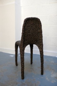
The comments over there (and there aren’t many) would indicate that most people aren’t thrilled with the results. It’s all so subjective, I can’t even begin to get myself involved in that. However, with no offense intended *in any way* towards Max Lamb(whom I don’t know, so this isn’t about him personally- Max, if you’re reading this, congratulations on your win), I have problems with that bronze chair in terms of the method of its creation (again, this isn’t an issue of aesthetics. ) I can absolutely guarantee that I have (significantly) more bronze casting experience than either the designer or the judges here (really, unless someone else has worked for a foundry for several years, they can just take a step back now.) I don’t care what it looks like- I care that the process used to make it was absolutely toxic(more so than regular casting), and there are ways to get that same effect that would have been less so.

(for the link phobic- this is the chair in question)

Bronze Poly chair, by Max Lamb

At a time when the industry is working so hard on issues of environmental concern and sustainability, it bothers me that this particular example is being shown as something that is given awards.

And now, I’m off with my camera. The Bus Stop Magnolia is blooming.

Well, whaddya know.

One of the photos I took of that ugly fucking monstrosity they’re unwrapping in Columbus Circle the “improved” 2 Columbus Circle building has made Curbed. 

There’s always a food analogy to be made.

I took the weekend off from writing, largely figuring with the holidays and all, no one was really online anyway except me. But I didn’t take the weekend off from working. In fact I got a lot done on the Miami house project, which is starting to congeal.

Yes, I said congeal. I find that design is a lot like making either chocolate pudding or hollandaise sauce. Take your pick. The point is that there’s a while at the beginning where you’re stirring and nothing seems like it’s really happening though you’re certainly stirring a whole lot. And then, all of a sudden the whole thing comes together and becomes food in one shot. Boom. Pudding(or sauce. Your call.) .

Aside from the fact that I now want chocolate pudding (or maybe hollandaise sauce.), that’s the best analogy of how work went this weekend. Miami has started to congeal. How’s that for a visual?

This is looking like a super busy week as well since I have a lot of projects on my plate, all of which are demanding attention.

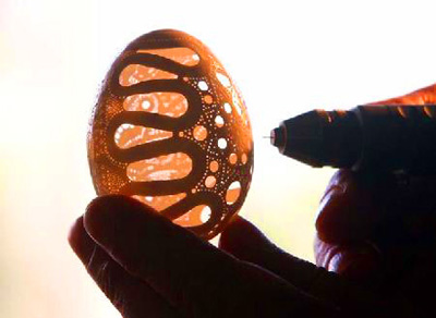
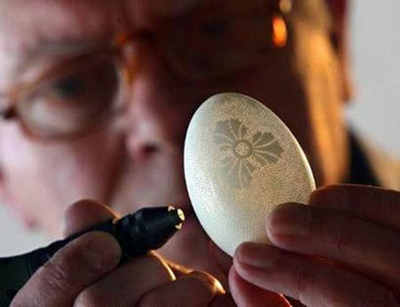
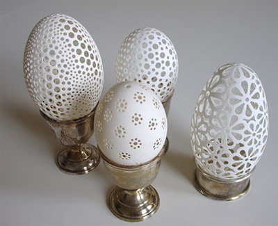
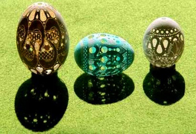
But aside from doing a lot of work on my own stuff over the weekend, I did get a boost of inspiration from this, which I saw over at momeld(they got it from Nat. Geo.) I have been fighting the urge to pull out my flexible shaft tool (I actually own three of these, and they’re far less obscene than their name would imply) and my box of micro drill bits to try to do this myself(I’m also thrilled I actually have everything I need to do this already in my house.) I do think that at some point I’m going to have to try this, though. It’s just so COOL. This work was done by Franc Grom, an artist from Slovenia.

02.jpg

03.jpg

05.jpg

04.jpg

And now, back to stirring my congealing projects.

Narrowing focus.

I’ve been reading a lot over the weekend about how creative people can best harness their abilities so they can also become more successful (since sadly, often you only get one without the other.) I’m still reading. It’s a lot to absorb and some of it is valuable and some of it isn’t, and some of it might be, but it’s so not who I am or ever want to be as a person that I don’t care how good the advice might be- I just know I’ll never do it.

One of the more valuable things that I’ve been reading about is how to concentrate on only a few things at at a time, rather than continually generating endless ideas that take energy to come up with, but never really go anywhere after that.  That’s not to say that you shouldn’t multitask,  but it’s a warning not to spread yourself *too* thin (which I do with pretty alarming regularity.)

All of this reading started because Nick Booth (the other guy from Birmginham) over at Podnosh linked up to Wishful Linking (which I highly recommend and for which I  thank Nick), which is a tumblr blog with nothing in it but links for creative people (which discipline is irrelevant, in this case.) I found myself reading all weekend, and I’m still not even close to being done.

In the interests of following that advice, which I think is pretty valid, I’m going to try to limit myself to ten things at once (which, when it’s opposed to INFINITE things, as it usually is,  becomes quite the reduction.)

Though I keep a list of things I’m designing over on the left there(all still in progress), that’s not all I’m working on.  I am also starting to investigate the prototyping of one of my furniture pieces in order to have it ready for next years’ rounds of international furniture fairs(yes, I’m serious.).  I’m always knitting *something* (at the moment it’s another hat for a kid undergoing chemotherapy treatment.),  there’s also always some kind of photography project going on(I have a stack of editing that needs looking at), and of course there’s an ongoing “search for a firm where I fit in” thing, too(still ongoing.).  I think that’s probably enough right now.  I feel almost badly for saying so, because it seems like I shouldn’t be turning away concepts and ideas but I think the spread too thin thing is valid and this will help my overall production rate long term.

I’ve been asked to present my thesis(though this link is technically SFW, if you work at someplace really conservative, I’d think before clicking.) again.  This time though, it’s to thesis students at Pratt to aid them in putting their own projects together.  Though I don’t have my presentation boards anymore (screw that- I never wanted to use boards on this project in the first damned place, and they were a token gesture at best. The moment my thesis was in the can I was on a plane headed for London, and I didn’t care in the least what they did with the boards- still don’t.) , this gives me a chance to present the project as it *should* be presented.  I have to find out how much time I’m going to be given, and if I’m going to be able to have the time to give a talk about how to approach these kinds of projects or if I’m going to only have enough time to present my personal project.  I think I also may redo the .ppt just to make it smaller (in terms of file size) and see if I need to create some kind of handouts in addition to my presentation booklet, depending on what kind of talk I’m ultimately going to be asked to give.

I think that’s plenty for a Monday morning.  Now it’s back to work for me.

Design as social commentary.

For all the time I’ve spent (and believe me, it’s been an OBSCENE amount of time) working on charity projects, I don’t possess much of a social conscience. I’m not an activist (though I do hold strong opinions on many things and I am a furious supporter of the City of New York) , I don’t talk about politics much (having a politician as a parent growing up has jaded me- honestly, I just don’t *care* what your politics are as long as I don’t have to hear about them)   I don’t suffer from any kind of Panda Guilt.  For me, design isn’t an exercise in social commentary.  I just don’t have it in me to create clever takes on cultural mores, since I find most cultural mores to be complete shit and not worth my attention.

So a couple of days ago, Dezeen coughed this one up, and I just sat there thinking “wow, that’s a hell of a punch for 3 small products.”

What am I talking about? This.:

half-truthsized.jpg

open-secrets.jpg

squarewhite-lies.jpg

Let’s talk about what these things are.

They’re scales, designed by Alice Wang, called “Asimov’s First Law”.  If you’re not as geeky as I am, the law in question is this one:

 “A robot may not injure a human being or, through inaction, allow a human being to come to harm.”

I am not entirely sure a scale qualifies as a robot, but okay I’ll let that one slide.  The top one is called “Half Truth”.  The premise is that the person on the scale cannot read it themselves. They are required to have someone else there to read the scale for them (and I suppose it’s up to the scale reader as to whether or not they want to tell the person on the scale the truth.)  The second, even more creepy, is called “Open Secret”.  The person weighing themselves has no idea what the results are. The results are transmitted via SMS to someone else, who then can immediately do whatever they want with that information, I suppose.  The bottom one is called “White Lies”, which operates on the principle that the farther back you stand on the scale, the less the scale says you weigh.

The first time I saw this set and read the article, I was horrified.  I mean genuinely horrified.  Worse still was the fact that the few comments that had come in seemed to think it was funny and lighthearted.  Except it’s not.  What the article *doesn’t* say (and it’s a dis-service to the designer, because this really should be mentioned up front) is that Alice Wang isn’t being cute.  Her bio states “She often uses products to illustrate human behaviours, social taboos and social trends. Her products question why people do what they do and how it will evolve over time leading onto other possible behaviours.” 

And when I read that the penny dropped, and I went from horrified to absolute AWE at the genius of this. Because if there were ever a way to shine a light into the dark corner of the psyche on the issue of weight and how it’s related to shame by designing a product? Oh, this has GOT to be it.  This is brilliant.  We’re used to seeing social commentary as visual art (paintings, murals, graphic design, and photography) and as words of course, but product design? Not so much- which makes this even more brilliant.

I think these products achieve her point like a nail gun driving it home.  Nice.


Good things, small packages.

No, this is not self-referencing.

It’s not a secret that suburban living isn’t something in which I take an interest. I leave that to people eminently more qualified (and who like it a LOT more than me.)  People start talking about housing developments and McMansions and whatever and my eyes glaze over.  It’s like that bit in the Simpsons where you see into Homer’s head and there’s that little monkey toy playing the cymbals.

But me? I’m a city kid.  Born in Manhattan, and raised in the Bronx. Gimme concrete and glass and the smell of rain on asphalt.

One thing urban environments have in common (and by this I mean real ones- not places like Los Angeles which are a whole bunch of suburbs strung together.) are that they have a shortage of space.  People have to economize on room, because square footage is expensive. Fortunately for me, this restriction on room brings out one of my favorite qualities of design- economy, or tightness.   It brings out the pragmatist in designers and I am at the very head of the pragmatist line.

Yesterday, I got treated to three fantastic examples of this kind of thing in my rss reader.

From 2modern, there’s this:

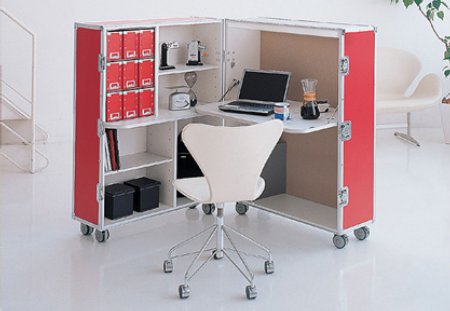
trunk station

How. Cool. Is. This.  It’s a portable office. Hell, it’s a portable craft station.  Think about taking this with you to a show! You just open, set up a work environment, and you work from wherever you are.  As much as people might bitch about the $1900 price tag, this is actually pretty reasonable.  Think about students who are moving into an apartment with housemates.  Just close it up, lock it and walk away.  It’s portable, if you have to move.   It’s FANTASTIC.

trunkstationofficeworkspaceredempty.jpg

Look! It even has the little hole in the tabletop for cables already cut out.  AWESOMESAUCE.

But wait! There’s more!

casuloclosed.jpg

I know, I know. So what. It’s a box.  But what’s IN the box, boys and girls?

casuloopen.jpg

It’s a whole room. There’s a video that goes along with this, that shows you can set the thing up in seven minutes if you know what you’re doing.  How’s THAT for tight? and when you need to move? Just back it all up back in the box.  I’m not saying this is perfect for everyone, but if you’re short on space, or are only going to be somewhere temporarily, so far it seems you’ve got both a completely portable bedroom and an office set up right here, for less than the cost (by a lot) of furnishing a whole apartment, for sure.

What’s that? But you still need to eat?  Oh okay.  For that we move to momeld, who brings us this, courtesy of designer Fevzi Karaman:

fevzi-karaman-smart-kitchen-design11.jpg

fevzi-karaman-smart-kitchen-design2.jpg

fevzi-karaman-smart-kitchen-design3.jpg

 Think about what you could do with all three. How much living you could do in such a small space (granted, the bed is probably not great for more than a temporary situation, or as a guest bed/couch)  but you have most of an entire studio apartment here. Tight, multifunctional, pragmatic, clean design.

See? Good things. Small packages. Wow, this is great stuff.


Keeping your self in check.

A few days ago I was speaking about how good residential design must be client driven. That’s absolutely true.  And no, residential design hasn’t moved up any on my “list of things I’d like to be doing.” (and really, I’d like to be able to stop making that disclaimer every time I mention it but I probably won’t for a while. Consider it my own personal neurosis.)   But even good residential designers often find themselves turned off by things that aren’t inherently *bad*- they’re just inherently bad *for them*.

Case in point:

I’ve been reading over at the Kitchen Designer’s blog about some new kitchen furniture designed by Hansen.  I read her blog in the first place because I find kitchen (and bathroom) design to be the least odious parts of residential work(interestingly, they’re often easily the most lucrative, though that’s coincidental. No, *really*, it is.  Stop it, all of you.) because they require a *designer*, always. A decorator *cannot* do this work (see: differences between decorators and designers, part #3,254).  Remember people- if there’s WATER involved, it’s *different*.  I’ll expand on that in another post maybe this coming week.

Anyway, back to what I was reading.

She’s been speaking about this stuff in glowing terms.  And so help me I keep looking at it…and looking at it… and looking at it…

hansen kitchen furniture


And I just can’t find a way to LIKE it.  It’s not a matter of aesthetics. I think it’s really quite lovely.  It’s not a matter of quality.  It looks and sounds like it’s excellent craftsmanship.  So what is it, then?  It’s because of a personal bias. I, personally, fail to see how this kitchen furniture works for people who really cook.   Because as far as *I* am concerned, a kitchen is a WORK space, as its primary function.

Let me specify here what my problems are, so it’s understandable.  I like this look. I think it’s clean and organic. I think it’s very nice. What I don’t like is that there’s no actual handles on these drawers. First of all, that little gap at the top so you can stick your hand in? All kinds of crap can fall in there when you *really* use your kitchen as something more than a museum exhibit and a place to store takeout.  Also, every cook I know? Gets dirty.  Those cabinets will be FILTHY around the opening in no time, requiring constant maintenance, and even with that, they will age unevenly, which is not a bad look if you like it- it’s the way real things age.  But this will happen at a drastically increased rate.

I like the LOOK of the furniture being raised on feet.  In *reality*?  It’s going to get *disgusting* under there, particularly if you a)use your kitchen in any real way b) have pets,  c) have kids.

 Let’s look at another photo from this same product line:

hansen_living-a.jpg

While I have no particular objection to open storage, this arrangement can be classified as…. well, just plain DUMB. I don’t get it.  There’s no reason for open storage in this configuration. It doesn’t save space, it doesn’t allow for easy access, you’re still stacking things, which means unstacking them in order to get them out  (as opposed to a hanging rack for pots and pans which allows for a much easier time of it) and I am not sure what that open rack is designed to do for you, other than drip water on your floor if you put your pans up before they’re fully dry.  Also, stacking stuff like that? It’s not attractive.  Why leave this open?  Unless of course, you don’t really use your kitchen as anything other than a showplace. So you have like, one pan, one pot and two bowls.  Nice and neat.  But not a kitchen for a cook.

“So what?  Not everyone really cooks in their kitchen, and these pieces look great!”

Absolutely *TRUE*.  Which is the reason for the title of this post. In order to keep your design client driven, you have to be able to identify that this is YOUR bias. Not an inherent problem with the pieces themselves.  That these pieces have legitimate applications- just not in YOUR house.  You have to be able to put that “turned off” feeling aside, because again, residential design isn’t about the designer. It’s about the client.  And with the right client, these pieces are perfectly acceptable.  It’s their house. Not yours.

Ego. Check yours. It helps your clients.